Layout Tips
Guides and Grids
It’s extremely helpful to establish columns, grids, and guides inside your design files. It makes it much easier to measure white-space for one, but also, developers have a lot of tools at their disposal to interpret those into responsive code. It communicates your intentions much more clearly.
Column Grids

Columnar grids like this, with even columns and gutters, are a nice way to establish a uniform grid system across an entire website.
In Adobe XD, you can activate and customize a column system by selecting the artboard and turning on the “Layout Grid.”
They may not work for every design, but the concept can be adapted for non-symmetrical layouts using manually placed guides as well.
Two-dimensional Grids

With the new CSS “Grid” feature, we can create two-dimensional grids as well. By “two-dimensional” we mean both columns and rows. These new features are pretty powerful, letting us specify dimensions of columns and rows by fractions, percentages, pixels, or let them adapt to their content.
You should have a basic understanding of Grid because if you make something look like a grid in your designs, we might try to use Grid to lay it out. Grid can do amazing things, but, there are little things it doesn’t do.
Cool Grid Stuff
Jen Simmons does a lot of thinking and advocating for all things web-layout. She’s a great resource for learning what Grid can do.
Not every grid cell needs content, they can be used for whitespace!
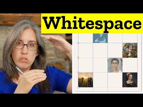
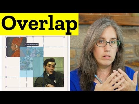
You can create overlaps!
They’re very responsive, in new ways
- New units called fractional units used to define sizes of rows or columns as ratios to each other.
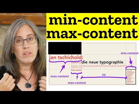
- Min/Max and Max Content Sizing
- We can base rows and column sizes on a given minimum and maximum, or actually base them around the content that might go in.
- Asymmetrical layouts become easier.
Size things with minimums and maximums, but let them flex in-between.
Here’s a couple of more general talks from Jen about web layout.
Modern Layouts: Getting Out of Our Ruts by Jen Simmons
Revolutionize Your Page: Real Art Direction on the Web by Jen Simmons
Here’s one last resource with some real world examples of layouts based on Grid.
Things Grid doesn’t do
- Things must fall on the grid, regardless of their size or how you want to align them. Items can’t arbitrarily cross grid lines unless specified.
- Grid probably isn’t the best solution if you just need to put some things on the same line, or you don’t know how wide your items will be.
- A grid cannot arbitrarily skip cells, meaning you can’t center something in a grid row unless you know in advance how many cells need to be skipped.
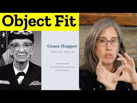
Object Fit
Object-fit is a way to make content items fill their given space in both directions, similar to a background image. It inherently causes cropping of the video or image, so should be used with care.
Responsive Example of Using Object Fit
This can also be done with videos, making decorative videos much more flexible.